BlogCSS Positioning
CSS Positioning
static, relative, fixed, absolute, sticky
Topics:
HTML
CSS
Read Time: 12 min
Published: 2020.07.02
Last Updated: 2020.11.09
The CSS-Property position overs various options to position your HTML-Element in the document.
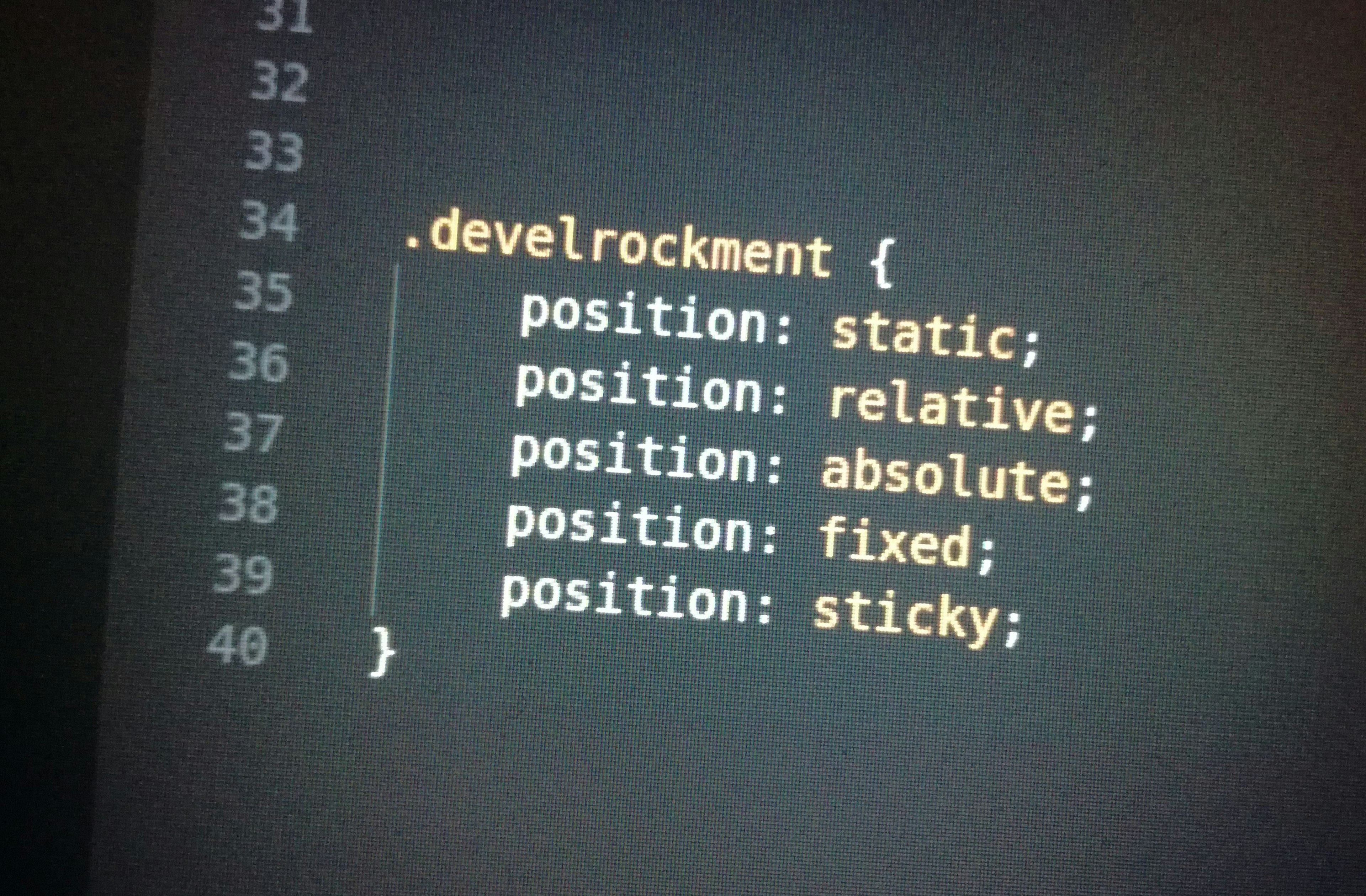
The following values are valid for position:
staticrelativeabsolutefixedsticky
Those can be used in combination with the CSS-Properties top, right, bottom and left in order to position your HTML-Elements accordingly.
For the sake of simplicity I am going to refer to top, right, bottom and left as “Direction-Properties” from now on. We get back to how they work in detail later on.
As an starting point we are going to use a simple HTML-File with some Lorem-Ipsum-Text:
HTML
<!DOCTYPE html>
<html>
  <head>
    <link rel="stylesheet" type="text/css" href="style.css" />
  </head>
  <body>
    <div class="container">
      <p class="text">
        Lorem ipsum dolor sit amet, consectetur adipiscing elit, sed do eiusmod
        tempor incididunt ut labore et dolore magna aliqua. Ut enim ad minim
        veniam, quis nostrud exercitation ullamco laboris nisi ut aliquip ex ea
        commodo consequat. <span id="position-me">Duis</span> aute irure dolor
        in reprehenderit in voluptate velit esse cillum dolore eu fugiat nulla
        pariatur. Excepteur sint occaecat cupidatat non proident, sunt in culpa
        qui officia deserunt mollit anim id est laborum.
      </p>
    </div>
  </body>
</html>
CSS
.container {
  padding: 100px;
}

#position-me {
  background-color: red;
}
We will be looking at the word Duis in order to see the effects of position. In order to have control I wrapped it in a <span>-Tag with the ID of position-me.
If we open the File in a Web-browser it looks like this:
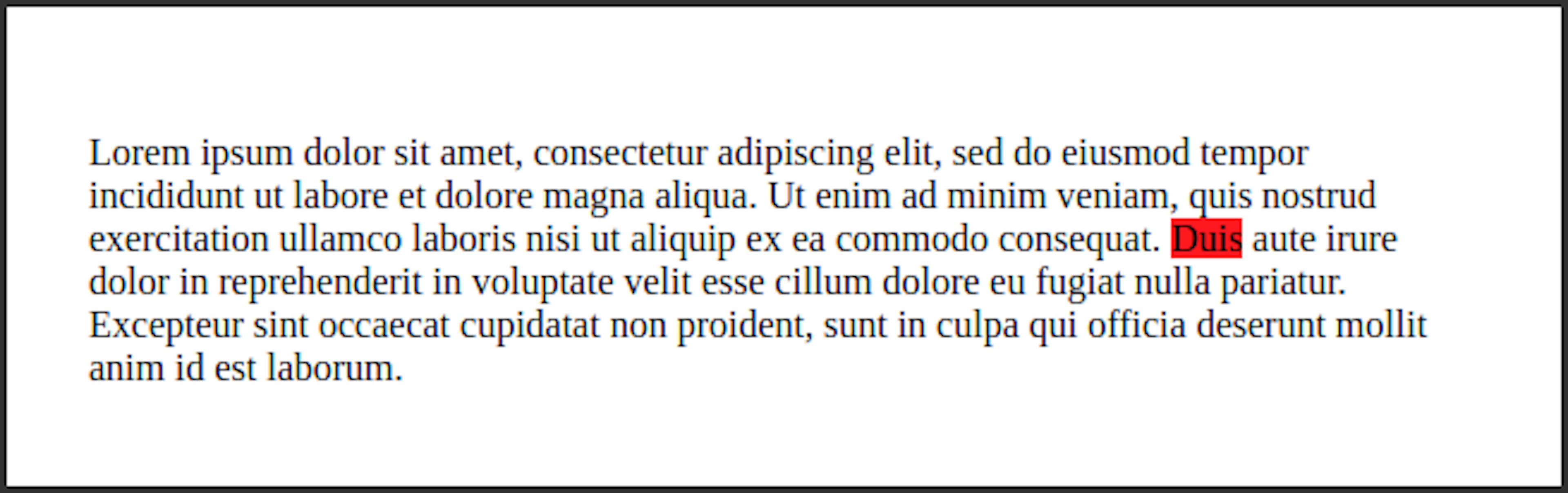
Static
All HTML-Elements in our example have position: static at the moment, this is because static is the default if you have not set any other value. (Every CSS-Property has some Default-Value)
The Direction-Properties top, right, bottom and left have the Default-Value auto.
If a HTML-Element is defined with postion: static, the Direction-Properties have no effect on the element. Therefor it does not matter if we define a Direction-Property, the HTML-Element will always stay in its position within the natural flow of the HTML-Document.
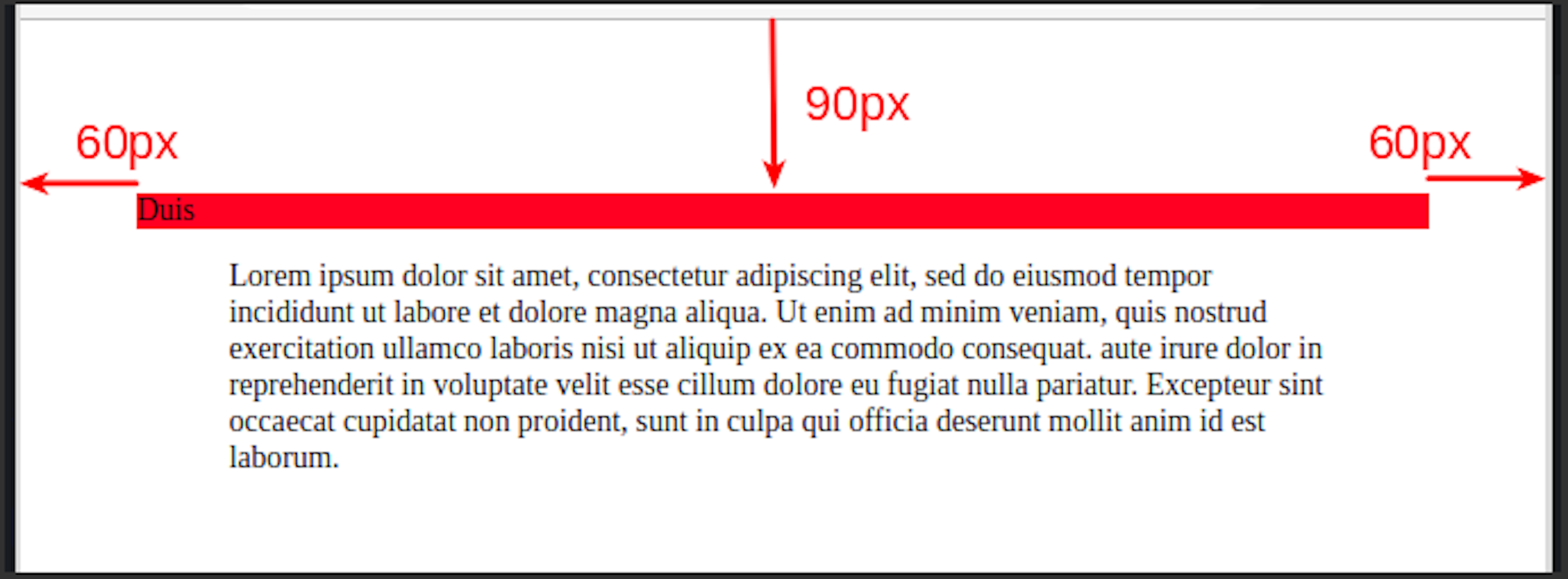
Relative
With position: relative we can position the HTML-Element relative to is origin-position.
CSS
.container {
  padding: 100px;
}

#position-me {
  background-color: red;
  position: relative;
  top: 90px;
  right: 60px;
}
In this case the Parent-Element (In our case <div class=”container”>) respects the old position of the HTML-Element, thus a hole remains in the text.
With the Direction-Properties we can now define how the HTML-Element should be moved relative to its origin-position. In our case we define top: 90px to shift the element 90px from the top and right: 60px, meaning 60px from the right.
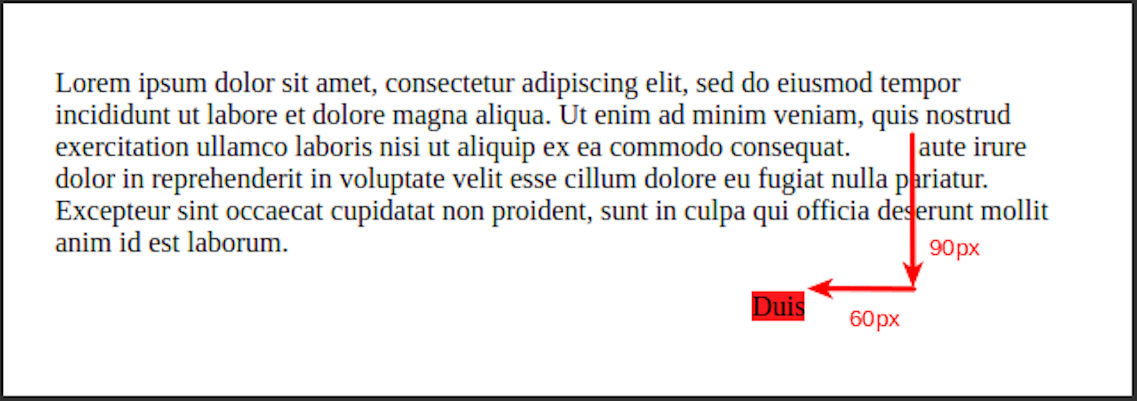
When a HTML-Element has an explicitly defined CSS-Property position (Meaning an other value than position: static), it will be placed on top of the Z-Stack in relation to other HTML-Elements. The functionality of the Z-Stack will be explained later in this tutorial.
Absolute
If we set a HTML-Element to position: absolute it will be pulled out of the natural flow of the HTML-Document. The other HTML-Elements react as if the HTML-Element with position: absolute does not exist in the DOM.
CSS
.container {
  padding: 100px;
}

#position-me {
  background-color: red;
  position: absolute;
  top: 90px;
  right: 60px;
}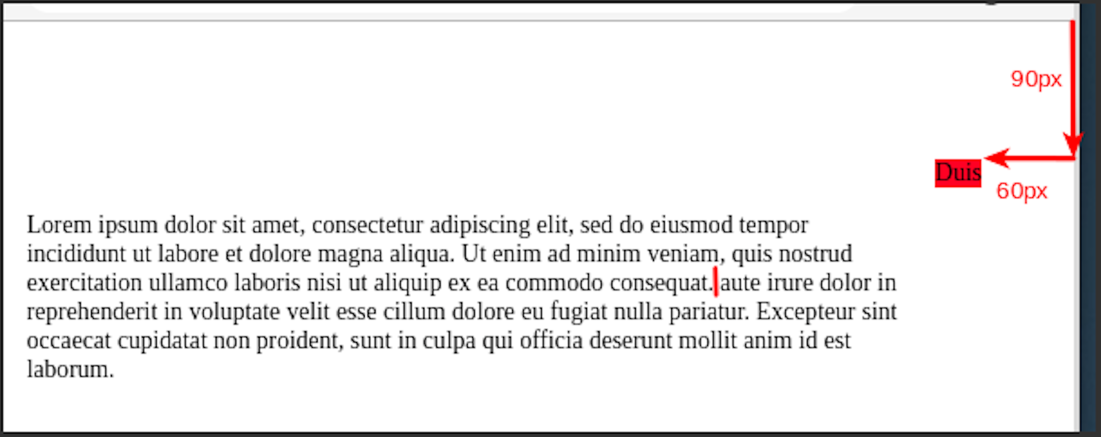
Our target word Duis is no longer on its old position. The words consequat. and aute are pushed together as if Duis would not exist.
When we define the Direction-Properties for a HTML-Element with position: absolute those properties are calculated in relation to the next Parent-Element with a defined position (Meaning an other value than position: static). When there is, like in our case, no Parent-Element with a defined position, the HTML-Element is placed in relation to the whole HTML-Document.
In our case that is again 90 pixel from the top and 60 pixel from the right.
If we define two Direction-Properties of opposite directions, so for example left AND right, the HTML-Element will be stretched in order to fulfill both parameters.
CSS
.container {
  padding: 100px;
}

#position-me {
  background-color: red;
  position: absolute;
  top: 90px;
  left: 60px;
  right: 60px;
}
The same works when using top AND bottom together.
Just like for position: relative the HTML-Element gets put on top of the Z-Stack when we define position: absolute.
Fixed
Just like position: absolute the HTML-Element gets pulled out of the natural flow of the the DOM with position: fixed. The other HTML-Elements again act like the element with position: fixed does not exist.
Also for position: fixed the element gets put on top of the Z-Stack.
A HTML-Element with position: fixed completely ignores its Parent-Elements. It will always be positioned relatively to the Browser-Window.
CSS
.container {
   padding: 100px;
   height: 3000px;
}

#position-me {
   background-color: red;
   position: fixed;
   top: 90px;
   right: 60px;
}
At first glance position: fixed looks just like position: absolute.
But the position is calculated relatively to the Browser-Window(The viewport) and not a Parent-Element. The difference gets visible when we start scrolling in the document.
Therefor we set height: 3000px for the .container in order to make the document longer than the Browser-Window. The HTML-Element with position: fixed gets "fixed" in its position when we scroll:
position: fixed comes in handy when we build a fixed header or a floating menu, for example a shopping cart.
Just like with position: absolute the HTML-Element can be stretched when defining opposite Direction-Properties.
Sticky
position: sticky can be imagined as a combination between position: relative and position: fixed. The HTML-Element will be positioned relative until the user scrolls so that the HTML-Element would leave the screen. Then the HTML-Element will continue to be in the window just like if it had been defined as position: fixed.
With that functionality we can force the HTML-Element to be always visible:
CSS
.container {
   padding: 100px;
   height: 3000px;
}

.text {
   height: 100%;
}

#position-me {
   background-color: red;
   position: -webkit-sticky; /* Safari */
   position: sticky;
   top: 0;
}
If we want position: sticky to work with the Safari Web-Browser we need to use the -webkit- Prefix.
Also we have to define at least one Direction-Property. In our case top.
Also for position: sticky the HTML-Element is put on top of the Z-Stack.
Z-Index
With the z-index we can define the order in which the HTML-Elements lie on top of each other.
The HTML-Elements with a higher z-index will be on top of the HTML-Elements with an lower z-index.
z-index only works for HTML-Elements with an explicitly defined position (Meaning all position values except static). HTML-Elements with a defined position always lie on top of HTML-Elements with position: static.
When there is no z-index defined the HTML-Element which is defined last in the DOM will be placed on top.
In order to get a better understanding of z-index we have a look at the following example:
HTML
<!DOCTYPE html>
<html>
   <head>
      <link rel="stylesheet" type="text/css" href="style.css" />
   </head>
   <body>
      <div class="container">
         <div class="red"></div>
         <div class="blue"></div>
      </div>
   </body>
</html>
CSS
.container {
   background-color: lightgoldenrodyellow;
   padding: 100px;
}

.red {
   background-color: red;
   height: 100px;
   width: 100px;
   position: absolute;
}

.blue {
   background-color: blue;
   height: 200px;
   width: 200px;
   margin-left: 40px;
   margin-top: 40px;
}
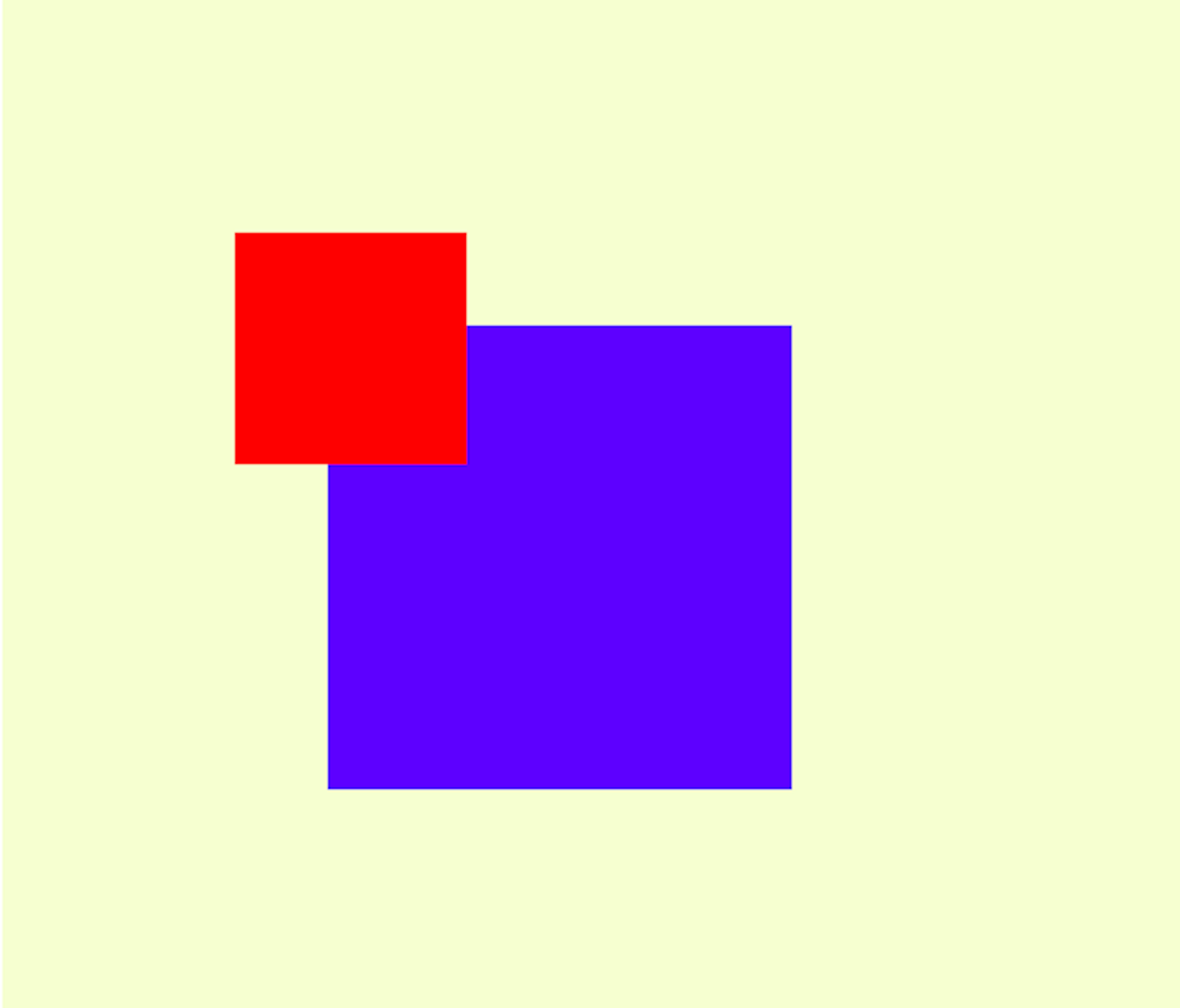
<div class=”red”> is defined after <div class=”blue”>, nevertheless red lies on top because it has a defined position: absolute.
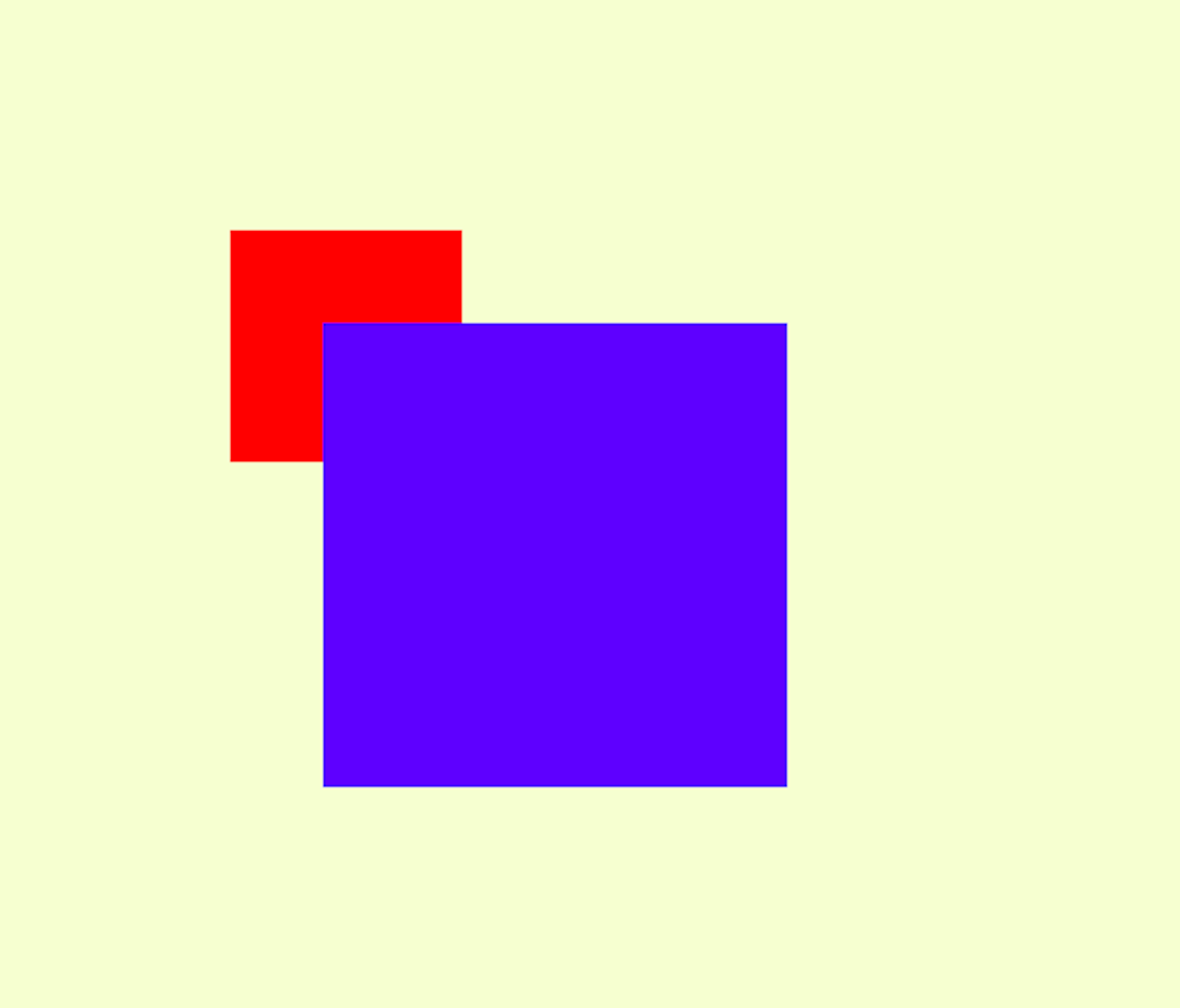
If we now define position: relative for blue as well both HTML-Elements would theoretically be on the same level in the Z-Stack. But because blue is defined in the DOM after red, blue comes out on top:
CSS
.container {
   background-color: lightgoldenrodyellow;
   padding: 100px;
}

.red {
   background-color: red;
   height: 100px;
   width: 100px;
   position: absolute;
}

.blue {
   background-color: blue;
   height: 200px;
   width: 200px;
   margin-left: 40px;
   margin-top: 40px;
   position: relative;
}
Now red and blue both have an defined position. That means the z-index can have an effect on them:
CSS
.container {
   background-color: lightgoldenrodyellow;
   padding: 100px;
}

.red {
   background-color: red;
   height: 100px;
   width: 100px;
   position: absolute;
   z-index: 2;
}

.blue {
   background-color: blue;
   height: 200px;
   width: 200px;
   margin-left: 40px;
   margin-top: 40px;
   position: relative;
   z-index: 1;
}
Because red now has an higher z-index than blue, red comes out on top.
Feedback Me: